Beginning Drafts
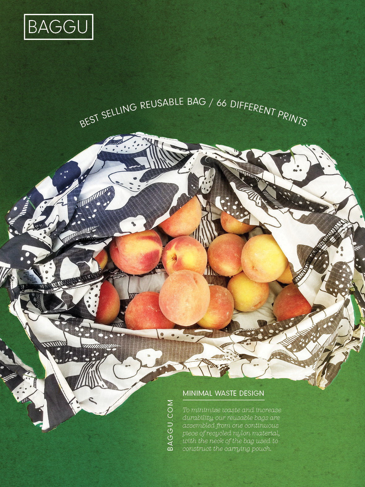
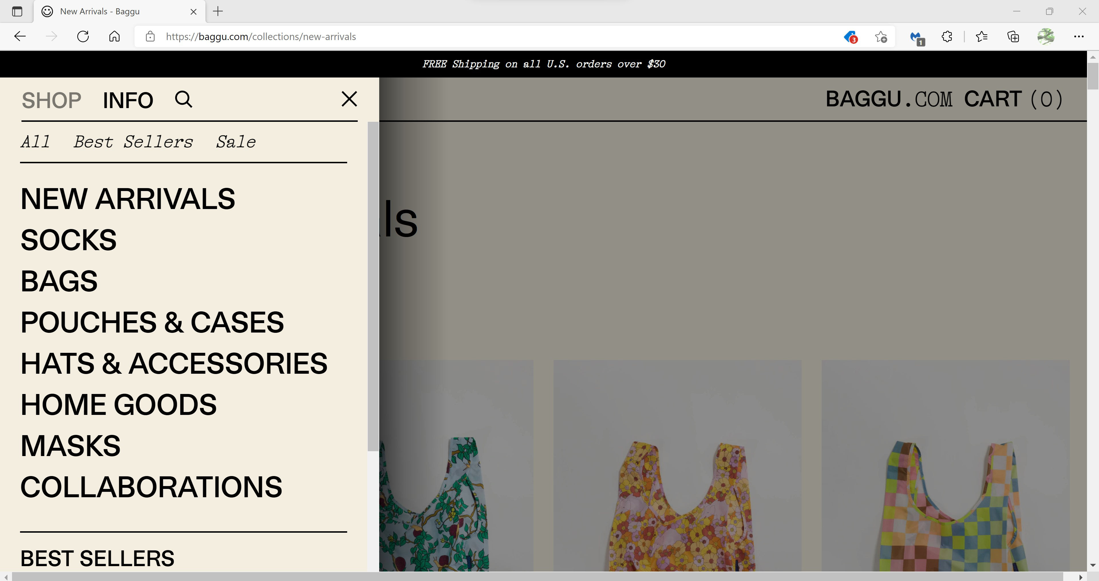
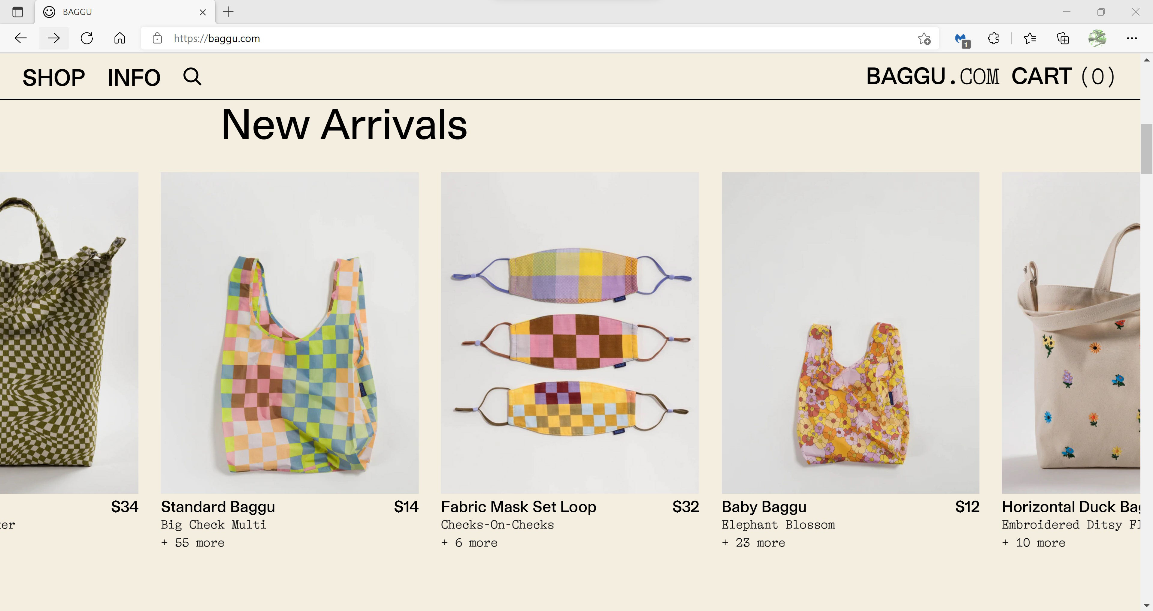
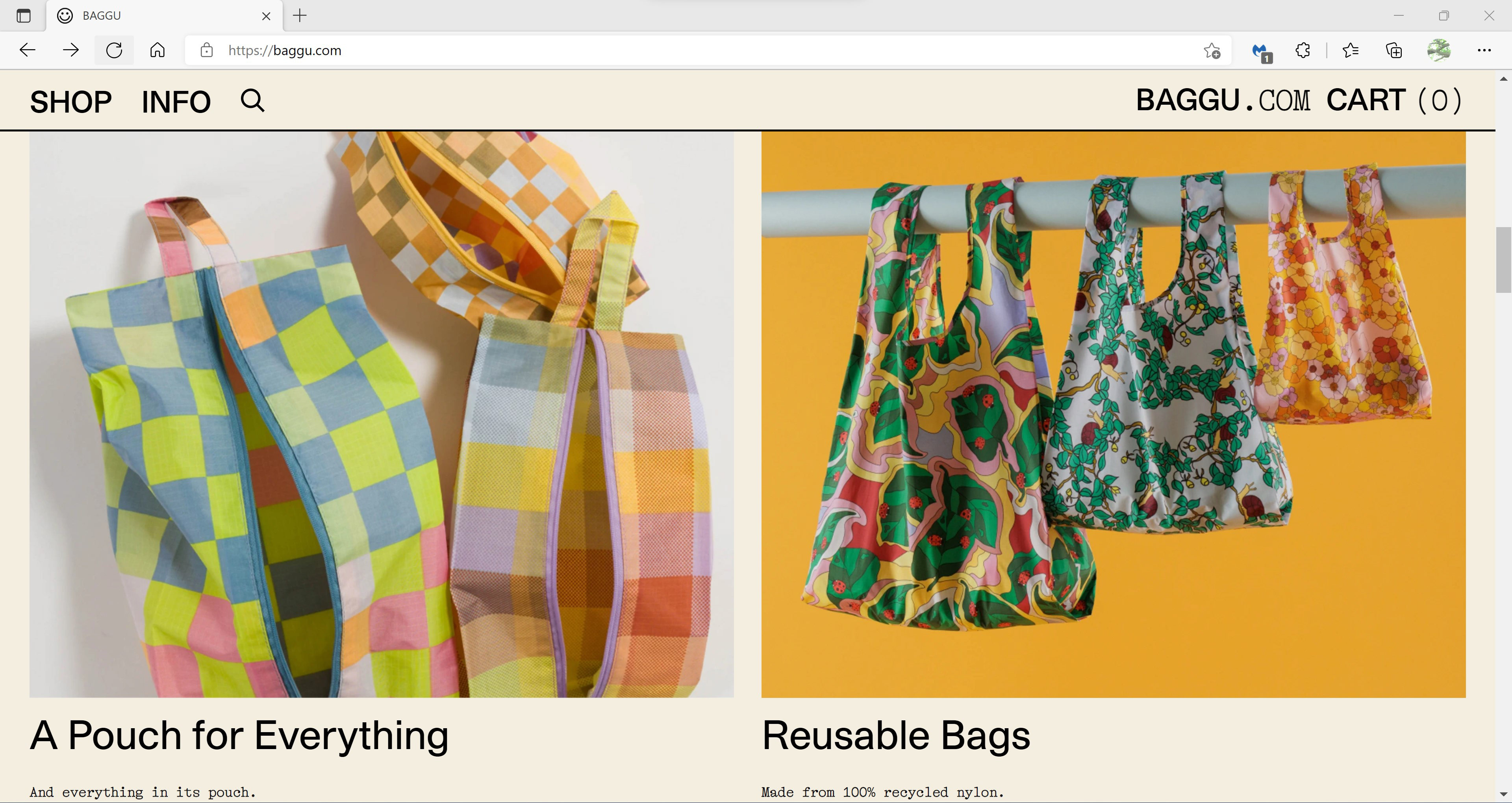
Here are screen captures of the Baggu website, and a template of a rough draft to get the ideas down. I had a lot of peaches which I wanted to use in the photo shoot. I decided to arrange the type so that it reflected their type on Baggu.com. Setting it up in this way shows exactly how the bag can be used.
Here are screen captures of the Baggu website, and a template of a rough draft to get the ideas down. I had a lot of peaches which I wanted to use in the photo shoot. I decided to arrange the type so that it reflected their type on Baggu.com. Setting it up in this way shows exactly how the bag can be used.
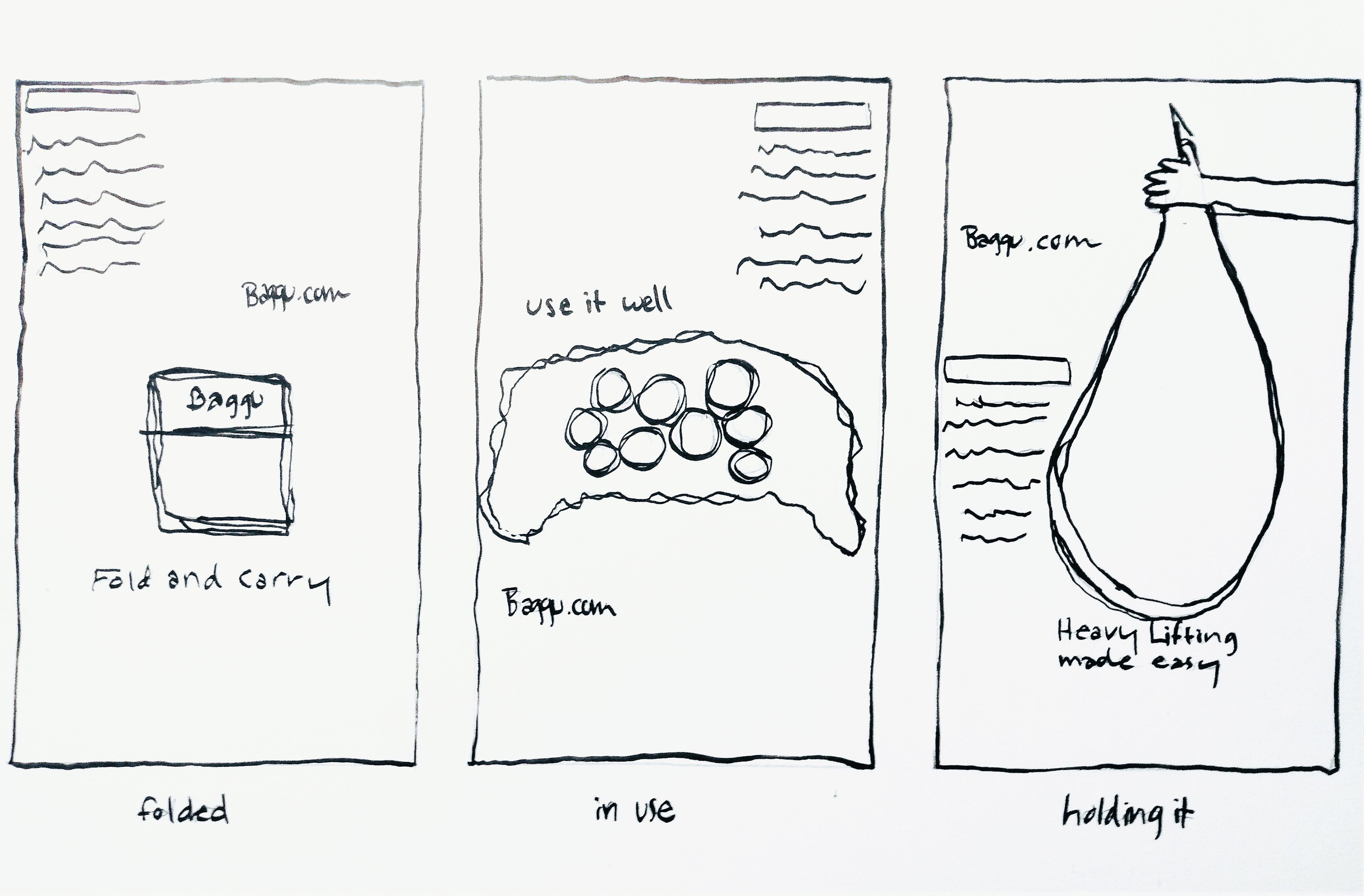
Rough sketches of Baggu ads
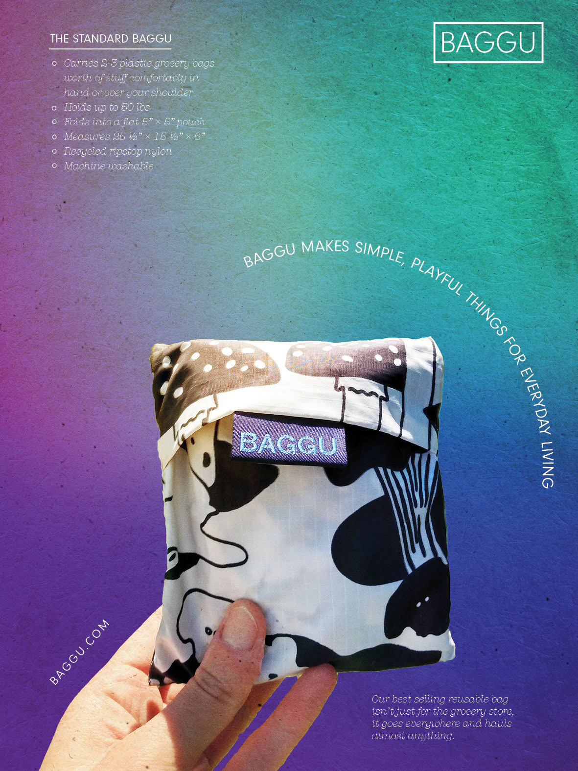
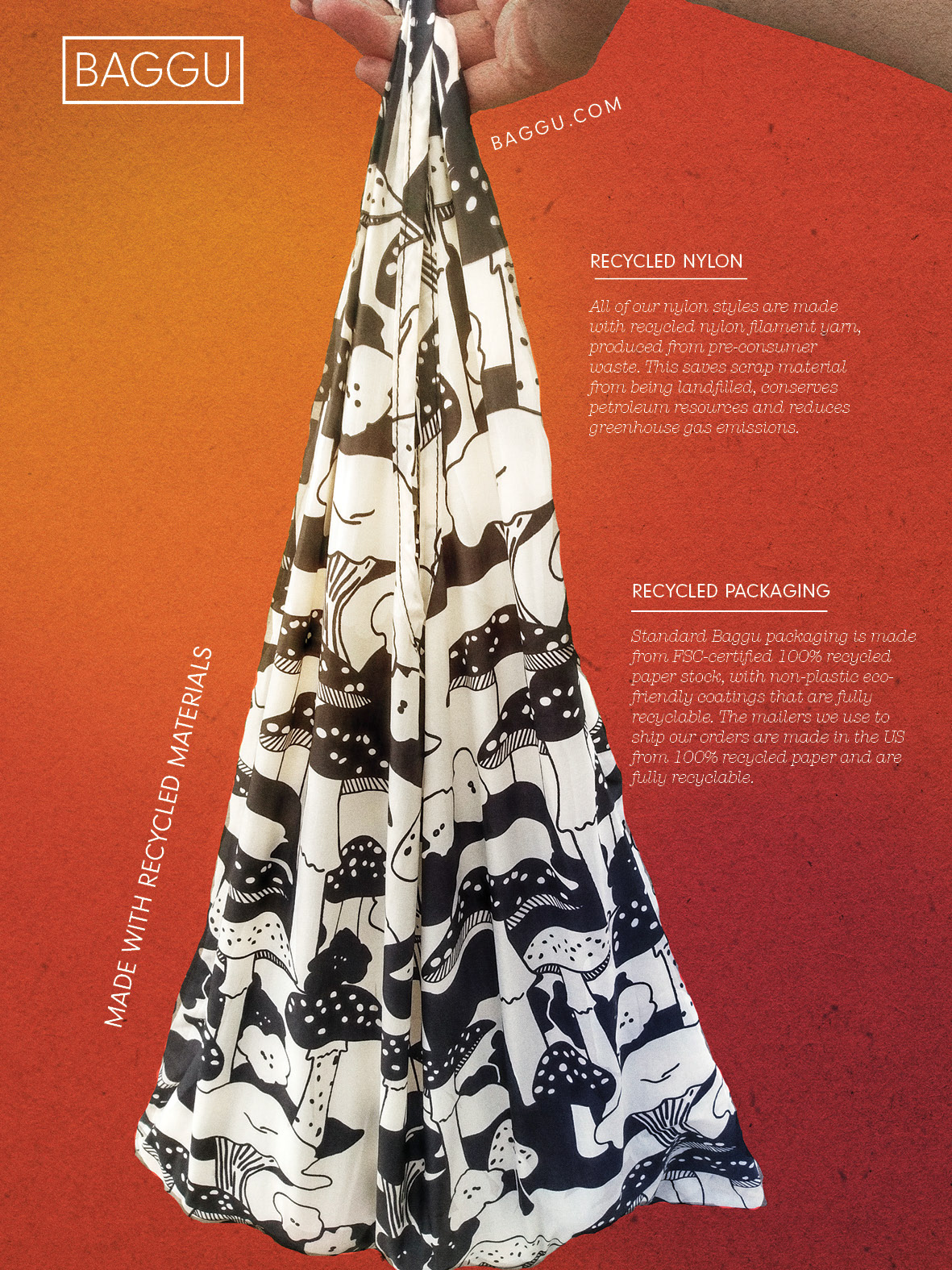
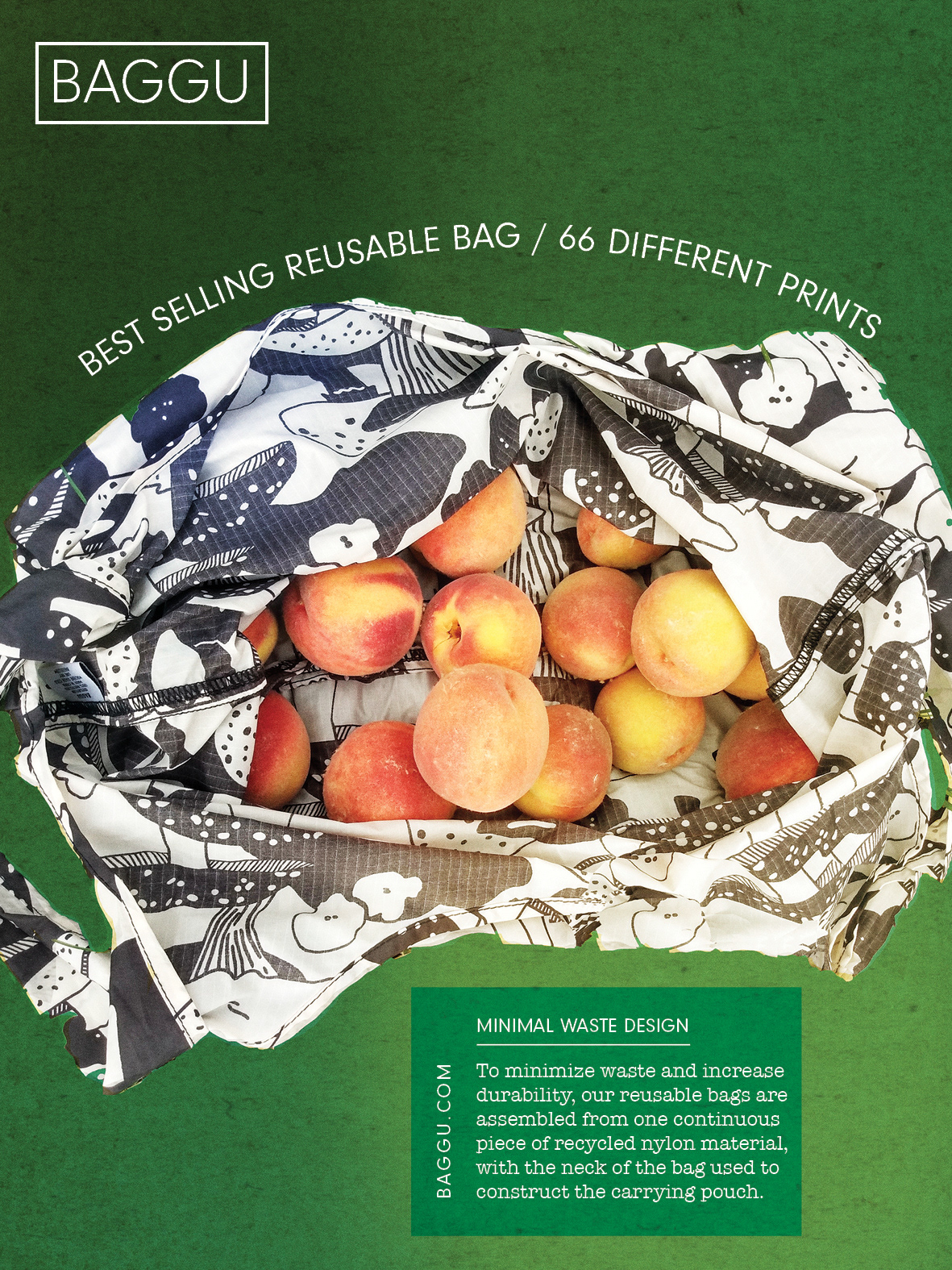
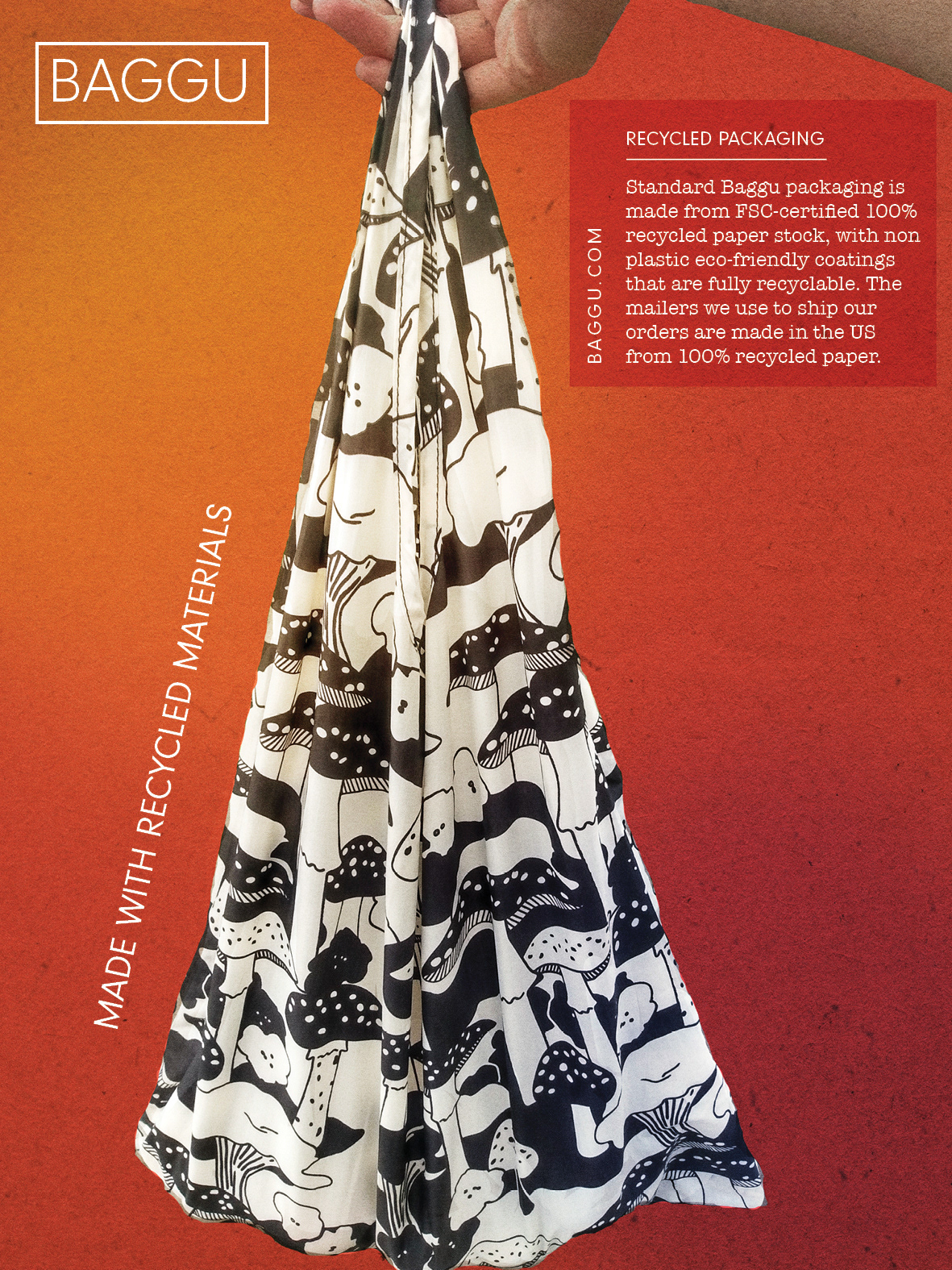
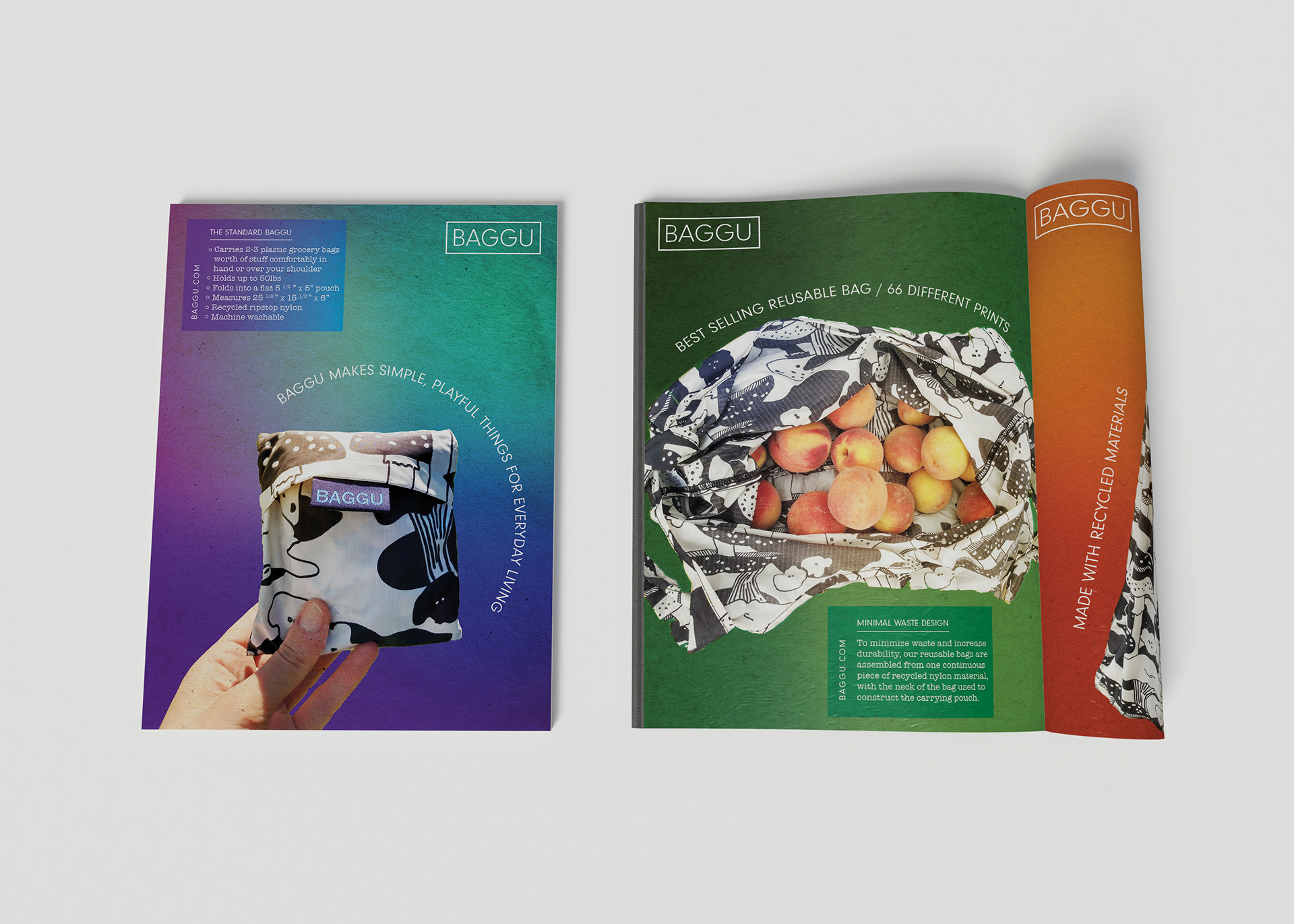
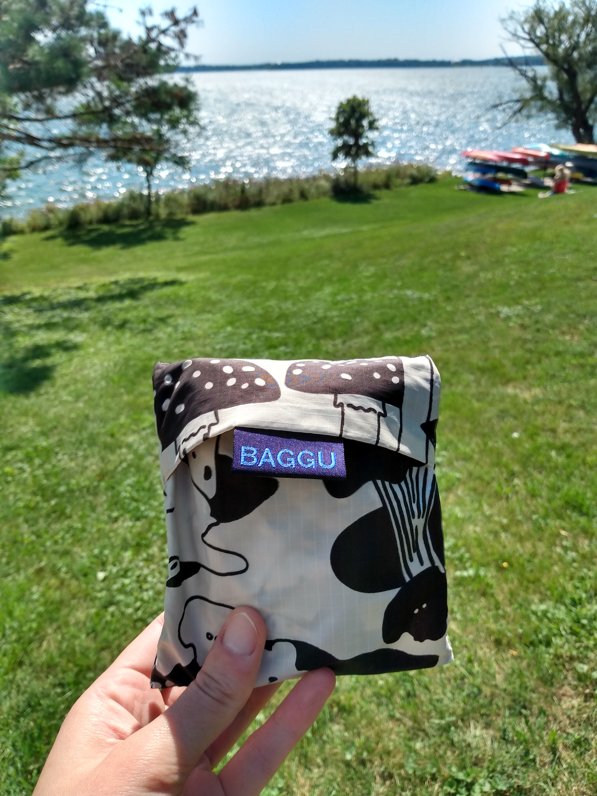
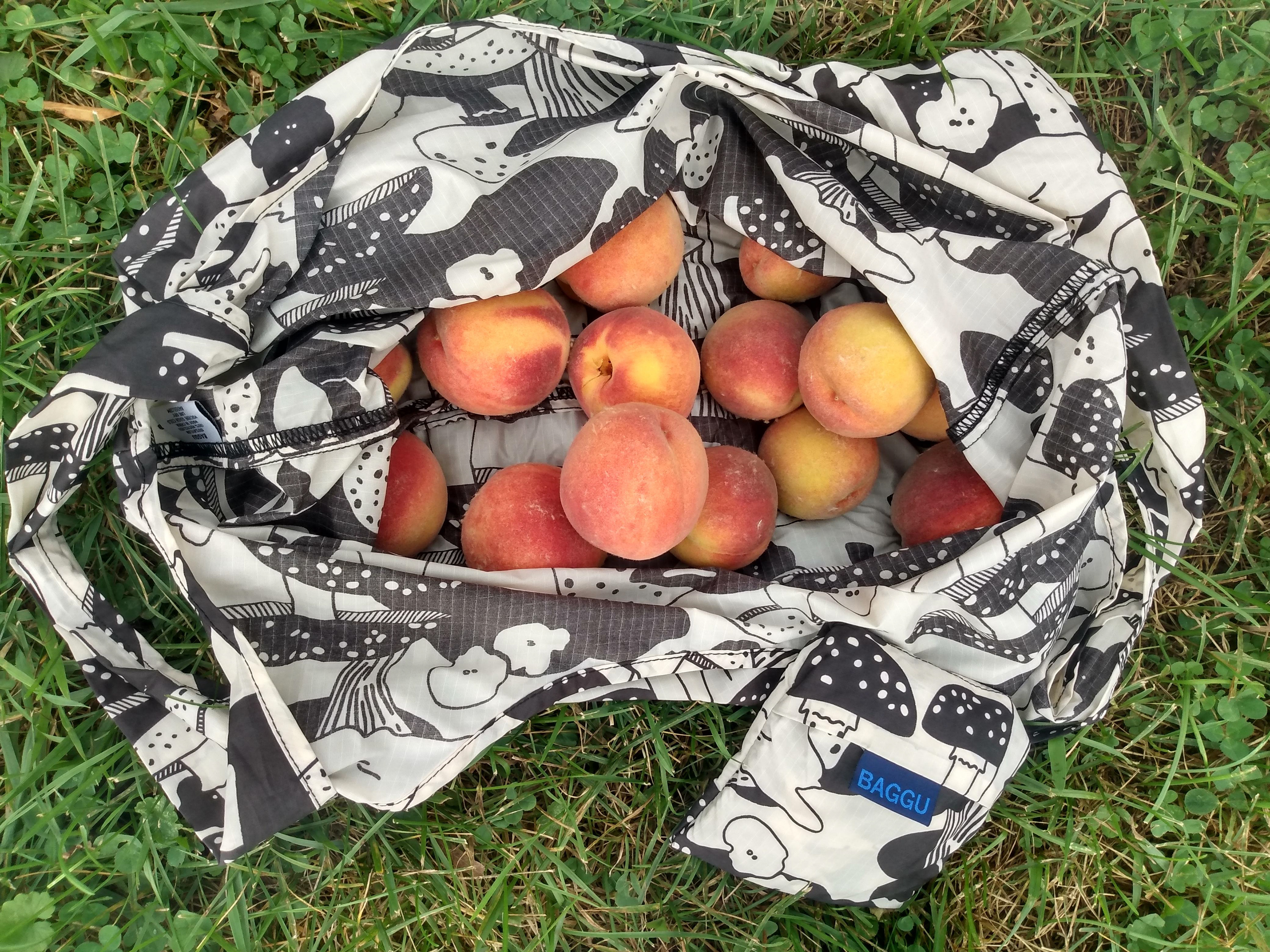
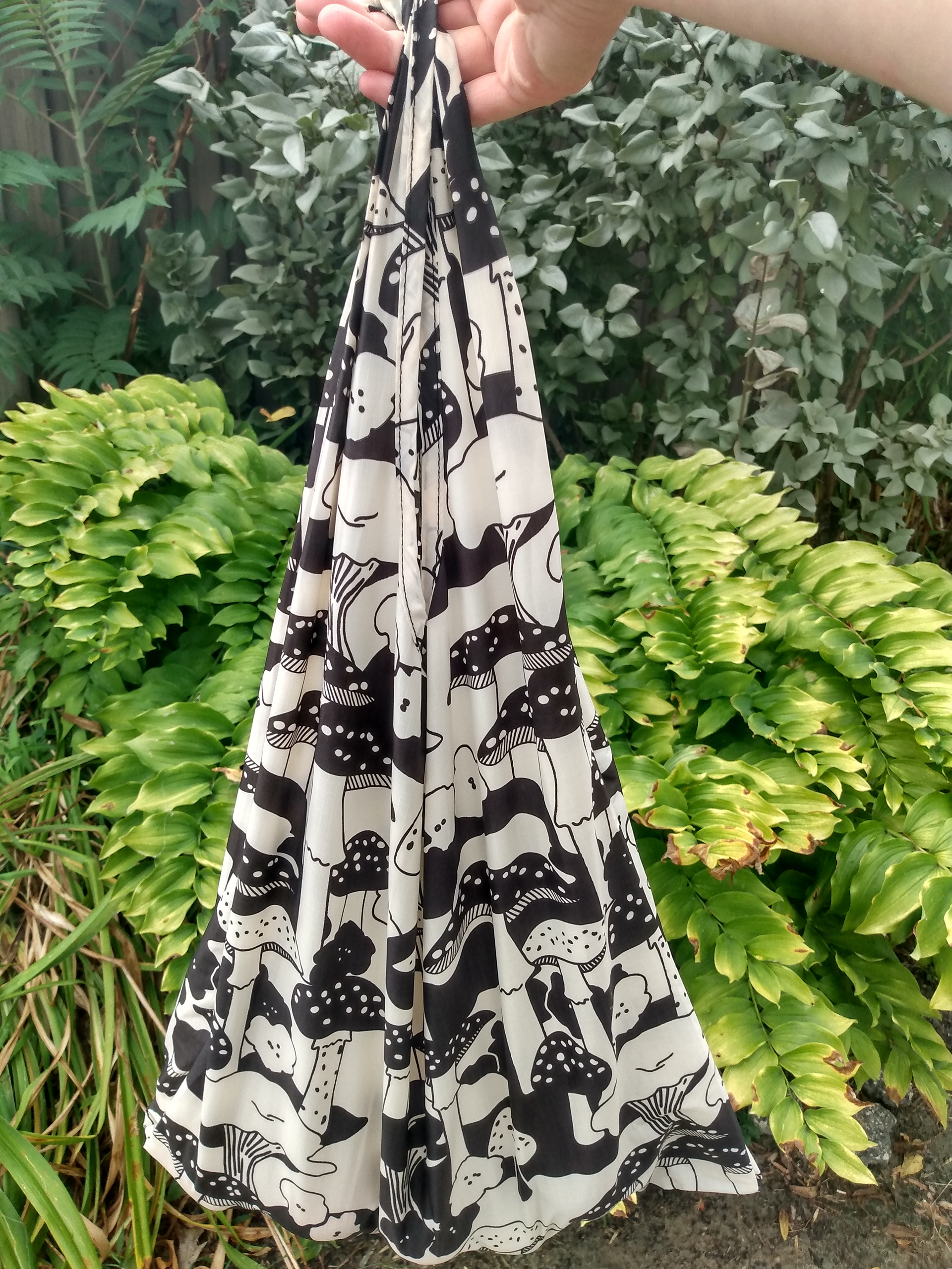
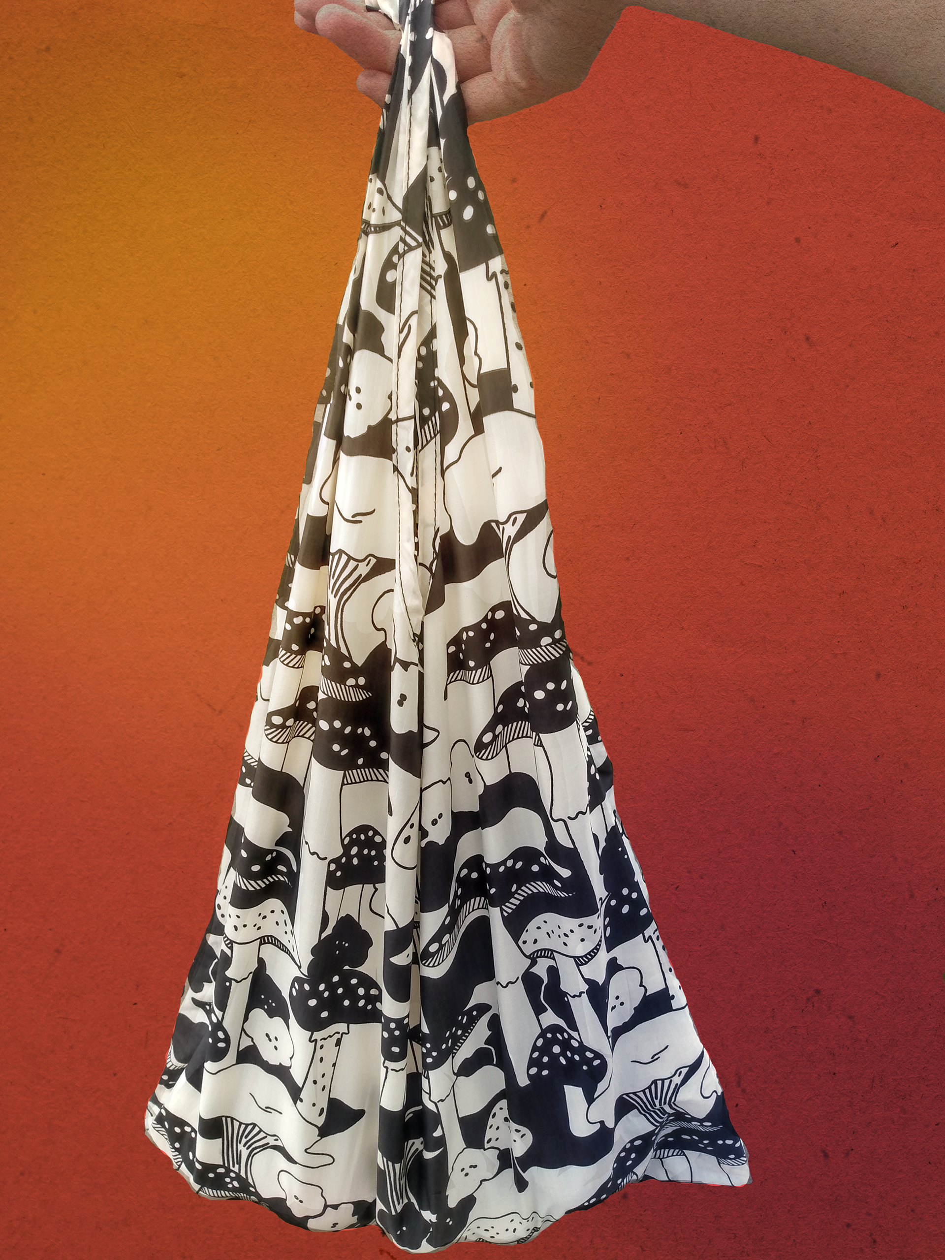
All photos were taken on a nice day outside with lots of sun. I wanted the bag to be highlighted and bright with plenty of contrast. This shows the three stages of the bag. It starts as a square that can fit in the palm of your hand, becomes a bag that can hold many pounds, and the final photo is the bag in use.
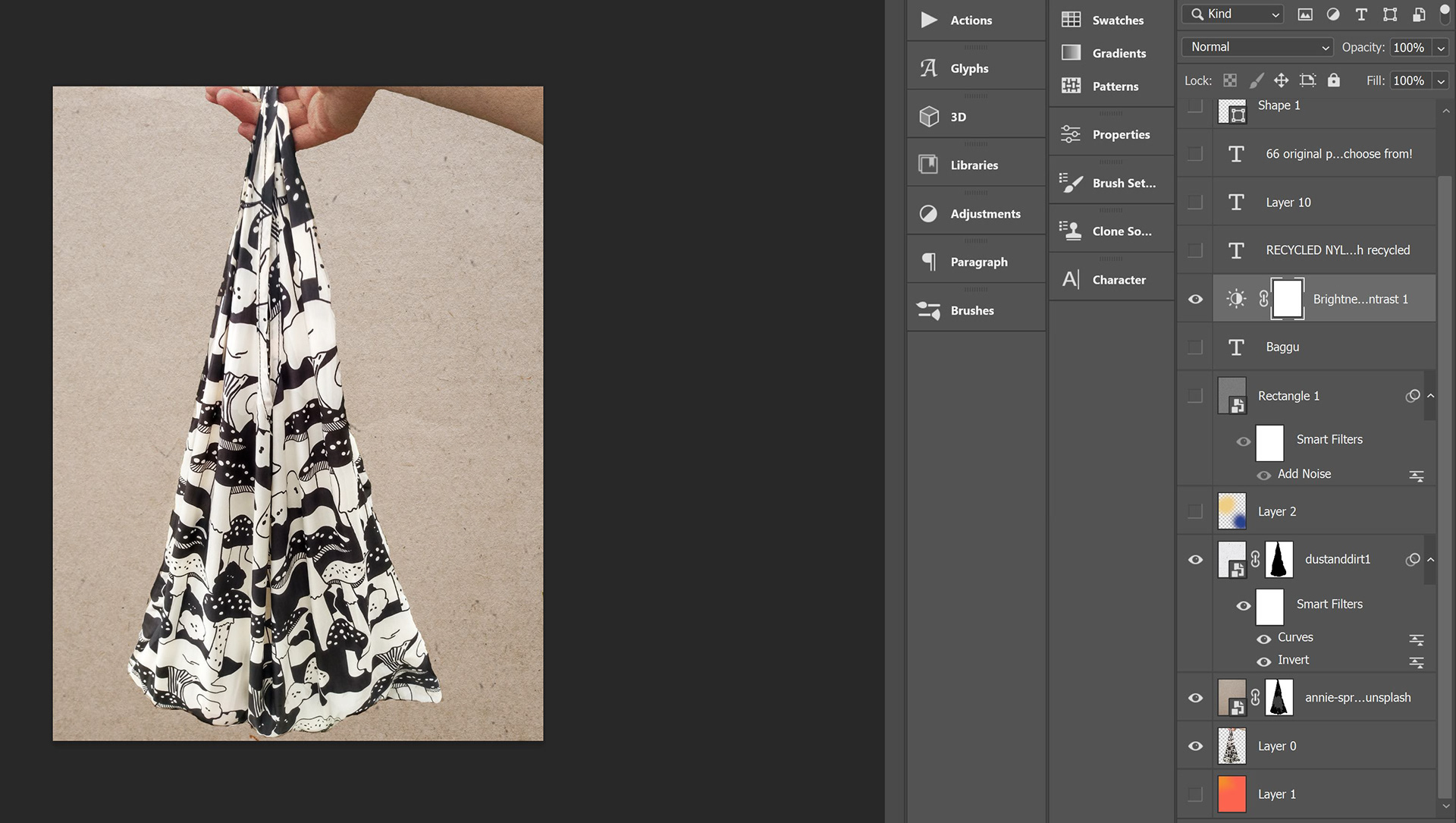
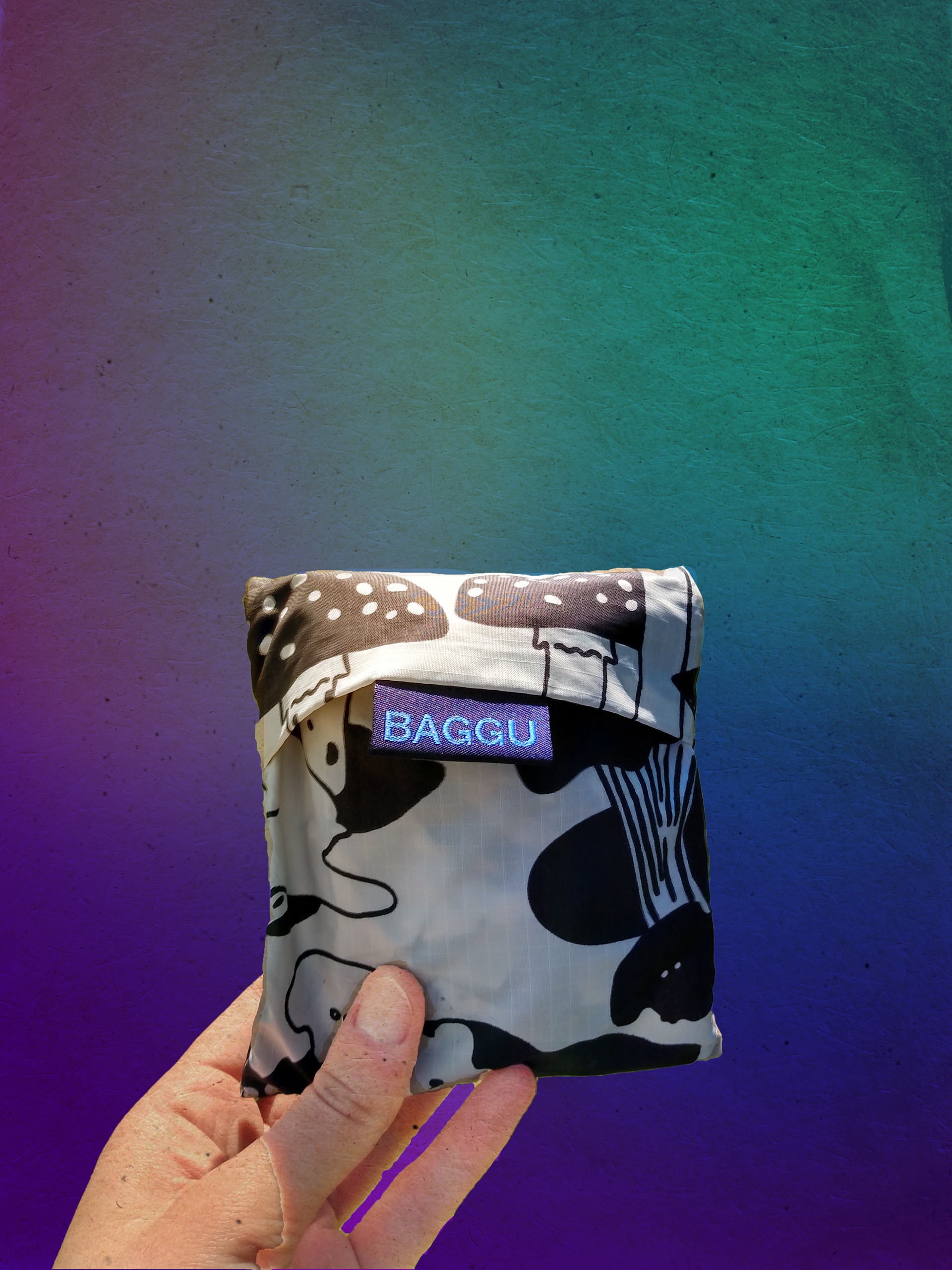
The screenshot below shows the many layers to finalize the design. You can also see some of the textures that were added. As a first layer for each I made a gradient of two colors. As other colors and textures were added the photos became more saturated, and made the image look older than it actually is. I isolated the bag itself so that it would pop in contrast. This vintage effect really unites them even while using entirely different background colors.


Here are screenshots of the photo editing almost finalized, and text has been brought in. As this was the first draft with text, there were several in between to get the typography to work well with the photos. I was able to take direction from their website on font choices and other design elements.
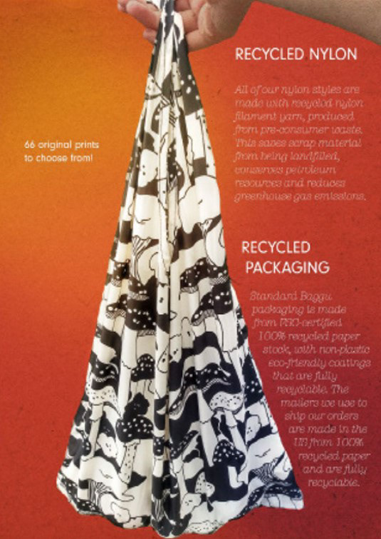

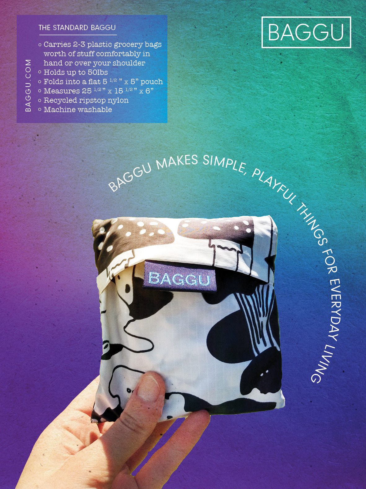
Beneath are the nearly finalized ads in regard to layout. The large changes between these and the first pictured are the addition of overlayed boxes for focus and legibility, the placement and removal of some text, and the increase in weight and sizing of the fonts with attention to margins for a standard magazine ad.